
Graphic Design Foundations: Using Symbols, Icons, and Photography for Clear Communication
GRAPHIC DESIGN
Arshia Shayestehtabar
2/22/20252 min read
In graphic design, simplicity can direct attention to meaning. Designs should spark curiosity and invite the audience to discover meaning in different layers of Design.
Use Symbols to Convey Meaning
Quick Recognition
Symbols act as visual shortcuts. For example, a lion icon can instantly evoke power. Major brands often use such symbols to create an immediate connection with their audience.
Fuse Metaphors
By combining symbols, such as a paintbrush with a fork, you can simultaneously hint at ideas like creativity and dining. This layered approach rewards viewers with a satisfying "aha" moment when they decode the message.
Smart Impact
When the audience deciphers the symbolism, they experience a subtle sense of intellectual discovery.
Use Minimalism in Your Layout
Keep It Simple
Minimal design means stripping away unnecessary elements. Each component must serve a clear purpose, avoiding visual clutter.
Process Over Decoration
Start with rough sketches. Let your initial ideas flow without worrying about perfection. Often, a strong idea doesn’t need elaborate decoration to be compelling.
Iterative Exploration
Develop your concepts by listing several symbols for each idea (you might even experiment with digital tools or brainstorming apps). Mix and match until you arrive at a design that communicates clearly.
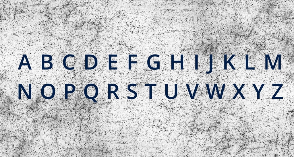
Minimal Typography and Bold Expression
Subtle Typography
Your text doesn’t need to replicate the final message exactly. Allow room for interpretation while keeping the typography clean and simple.
Key Typography Tips:
• Choose forms that reflect the tone of your message.
• Be bold yet minimal in your design choices.
• Use a restrained color palette and simple fonts.
• Most importantly, enjoy the creative journey!
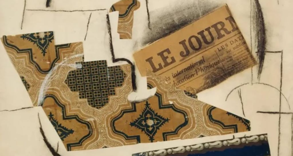
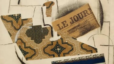
Integrate Photography and Collage
Photos vs. Icons
Photos typically convey a wealth of detail, while icons offer clarity through simplicity. In design, photos represent reality, whereas collages or hand-drawn elements provide a subjective, artistic interpretation.
Creative Pairings
Placing two photos with contrasting themes side by side can generate a fresh narrative that invites viewers to explore new meanings.
Historical Layers
Incorporating vintage or historical photos can add depth. For example, when designing a book cover or poster, you might assemble several carefully chosen images, each symbolizing a distinct concept, so the viewer can piece together the intended story.
Deepen Your Understanding
For those looking to refine their design process further, exploring a broader set of principles of graphic design can be enlightening. There’s a resource available that outlines practical guidelines and fundamental rules for graphic design. This insightful guide is titled 40 Necessary and Fundamental Rules of Graphic Design which was published on Amazon. Its practical insights can serve as a useful complement to your creative toolkit.
By using a minimalist approach, you allow your design’s message to shine through effortlessly. Use symbols, typography, and photography wisely to create work that is not only visually appealing but also intellectually engaging. Let your designs speak volumes with simplicity and depth.